"Do not Let me Think"
Starbucks membership product redesign


Skills - user testing, user interviews, research, prototyping, and UI/Visual design.

This membership system is too complicated for me to understand. There are so many tricks and regulations here but I just want to drink coffee. Do not let me think!
------------ Jennie, Starbucks membership in China
Starbucks membership app in China is confusing for customers
Through 5-star user interviews and research on design rules, we have learned the following existing problems:
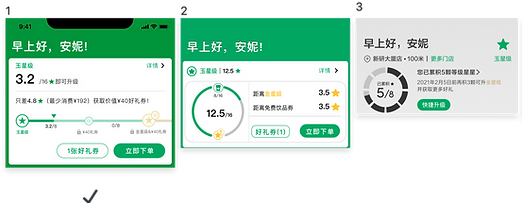
Existing Levels
Homepage

The different level uses different data visualization to display the progress of membership which makes users confused.
Member rights are not transparent
Member rights are not transparent
Existing Gold level homepage

The style of the member homepage and details page is not matched
Existing Gold level Detail page

The display of the membership mechanism is chaotic and complicated.
Data visualization is confusing. Users do not know the meaning of the symbol of “star”.
What Customers Say:
We interview 8 Starbucks membership members and understand their concerns and requirements.

I do not understand Starbucks rewards and I do not want to understand, now it is too complicated to understand

I do not know which level I am.

I do not know how to upgrade and how to keep my rewards and level.

What is the difference between “rewards star” and “level star”? How can I get stars?

At the gold level, I do not understand the meaning of “star”. What happened when this “ star” is filled?
I feel frustrated when I try to understand regulation policy of Starbucks membership because I never understand
Set the KPI based on customers needs and feedback

1. Improve the recognition of customers about the membership rewards
Users understand their current level and stars, accumulate progress, what goals and rewards can be obtained, users understand the meaning of decimals
2. Help customers understand the regulation of membership correctly.
Users understand different levels of membership rules (how to upgrade to get gifts) Users understand different levels of membership rights

3. Motivate users to upgrade and redeem gifts to promote the consumption
Users know their accumulation progress at any time, are motivated to consume continuously, upgrade to get good gift
Brainstorm ideas to find different solutions
Design Solutions for KPI 1
Improve the recognition of customers about the membership rewards Homepage
On the Mobile home page, to reach the KPI, we come up with different ideas of data visualization to explain the rewards, membership level, and level process.
Progress bar to explain the progress

Donut chart to display the progress of the membership

User “Star” symbol with the number to explain how many star points the customer already got.
“Cup” symbol with the number to explain how many stars points the customer already got.
On the membership detail page, we use the different strategies to reach the approach
Help customers understand the regulation of membership correctly in membership detail page
Design Solutions for KPI 2

Display all detailed rewards and regulation of membership system

Comparison chart of different levels of membership rewards and rules

Explain separately about the meaning of “level star” and meaning of “gift star”
Design Solutions for KPI 3
Motivate users to upgrade and redeem gifts to promote the consumption
To achieve the goal, we try to display more information about rewards and add new features.

New feature: Order Now
to motivate customers to order a drink immediately

Remind users of the coming expired star points

Display the rewards of the next level of membership if users consume more to upgrade.
Validating interaction methods by user testing
For more than 10 users testing, we use 5 seconds testing method to let the user choose their preferred interface design
Validating interaction methods by user testing
For more than 10 users testing, we use 5 seconds testing method to let the user choose their preferred interface design
Homepage redesign solutions

Most of users choose Design 1 & 5 as their expectation
1. Show the most useful information on the homepage.
2. The most important information for users: existing membership levels, differences between
existing stars and target stars, what kind of rewards are obtained.
3. Users don’t care about the source of the decimal point, but more concerned about the
difference between the existing star points and the target star points.
Membership detail page redesign solutions


Most of users choose Design 1 & 2 as their expectation
1. The membership details page displays comprehensive information to encourage users to consume,
quick upgrades and get redeem gifts
2. Users care about real-time rewards, fast level upgrades and get gifts
3. “Comparison chart of different levels of membership rewards” are praised, but users think it can
be placed on other pages because they are second-level information.


A Different Data Visualization Design in Gold Level solutions
Most of the users choose Design 1 & 4 as their expectation
1. In Green level and Silver level, users think the homepage is clearer and easier to understand with the progress bar
2. In Gold level, users hope star points need to reflect the relationship between "star points that can
be redeemed for good gifts" and "the progress of the next good gift".
3. In Gold level, about data visualization, users like the symbol of “stars” than the symbol of “cup”
Final Design Solution
Based on the user testing result we combine the design approach which most achieves users’ expectations and decides our final design solution for the Starbucks membership rewards system


KPI 1: Improve the recognition of customers about the membership rewards Homepage
Important design pattern iterations

Users cannot understand what level they are, do not understand the data visualization of Gifts Star points, and do not know how far they are from the next gift

The New design reflects the relationship between "stars that can be redeemed for gifts" and "the progress of the next gift", differentiates expressions, and improves awareness of membership rules and rights
KPI 2: Help customers understand the regulation of membership correctly on the membership detail page

Users cannot understand the data visualization of Good Gifts Star, do not understand the gap from the target, and do not understand the benefits of Venus

Clearly express comprehensive information based on the homepage
Remind users that gifts and stars that are about to expire can help users better understand their rights and promote consumption
KPI 3: Motivate users to upgrade and redeem gifts to promote consumption

Use the progress bar to clearly express that users understand their current level and stars, accumulate progress, what goals and rewards can be obtained, and improve the awareness of membership rules and rights
The user cannot understand what level he is in and does not understand the meaning of 2/4
Outcome and Effects

I like the new symbol of "Smiling Star"
Its funny and cute expressions
Customers like the new design
“I like the new design, the catalog is clear at a glance, I can quickly understand the gift certificate information obtained by my stars, my level information and benefits”
“New design presents more information. I don’t need to click on other pages to get all the information I want to know.”
“I really like the white design. It is intuitive, comfortable, and not boring. The interface page looks good. The black page is boring. I have no desire to read”